
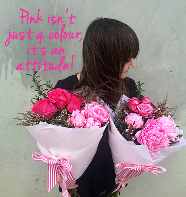
Anyone who knows me well would know that I am partial to a pop of pink. (Yes, one look at this blog and I get it; stating the obvious…Oy Vey!)
As a child I chose a pink floral wallpaper for my bedroom, even finishing the mouldings in pink. (Nothing like viewing a Huntsman spider against a backdrop of whimsy ![]() ) White furniture popped against a carpet of coral giving the room a light bright breeziness.
) White furniture popped against a carpet of coral giving the room a light bright breeziness.
To this day, nothing seems to have changed ![]() My itsy bitsy apartment in Greenwich Village is featured in hues of the shade, maybe a little more grown up in its demeanor (I have fuchsia steel legs on the dining table) but still very pink!
My itsy bitsy apartment in Greenwich Village is featured in hues of the shade, maybe a little more grown up in its demeanor (I have fuchsia steel legs on the dining table) but still very pink!
It’s a statement colour most definitely, but still relaxing and liveable and because of the energy, works in almost any space. Which is why it has been such a hit in my NYC size six and a half ![]() shoebox!
shoebox!
Anyhoo, I didn’t seem to ever consider pink off limits, even during those very under-confident edgy years of teenagism, instead, often finding a way to work it into what I felt was an on-trend retro vibe
Pink has always been associated with feminine cute and baby daughters. However, sometime whilst no-one was watching, a pink revitalization has happened. This hue is now all class and sophistication, catering to the woman of many moods.
Take the pastel pink, looking smart and chic in a twin set. This tone screams all 50’s Gigi innocence but also, all savvy business (especially when pearls are added) and can be a wonderful choice at the office where perceived opinion runs rampant. Devilish I know, but it’s just all about working it and there is no rule legislating pastel equates to demure ![]()
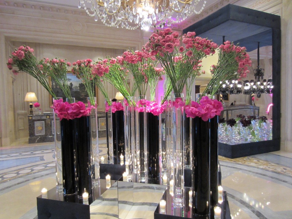
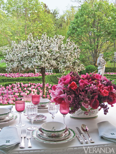
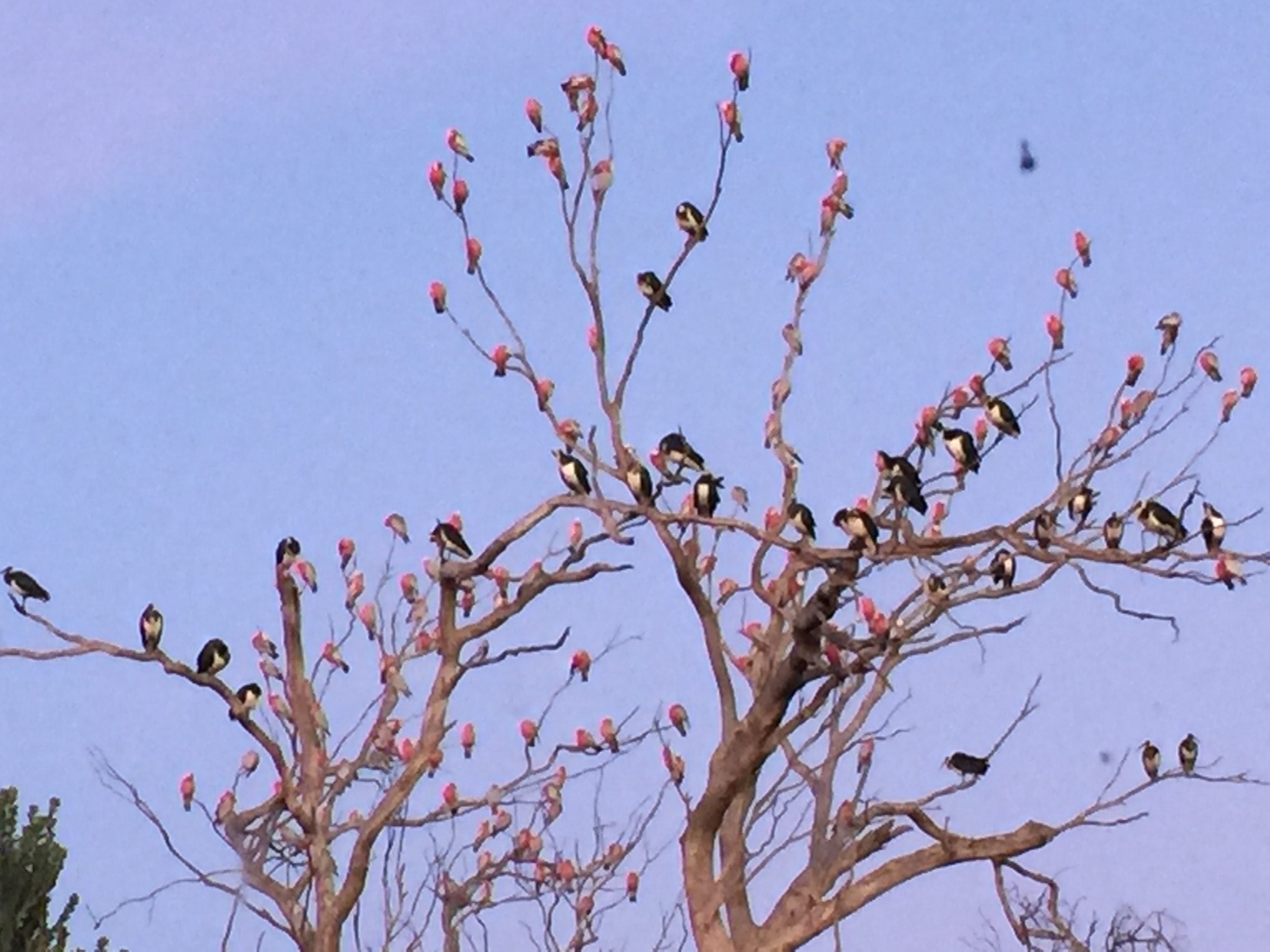
Tinerate, this versatile delight of bright is able to hold its own in any of the many assortment of related tints that are crowding the colour board…if in doubt, just take a cue from nature ![]()

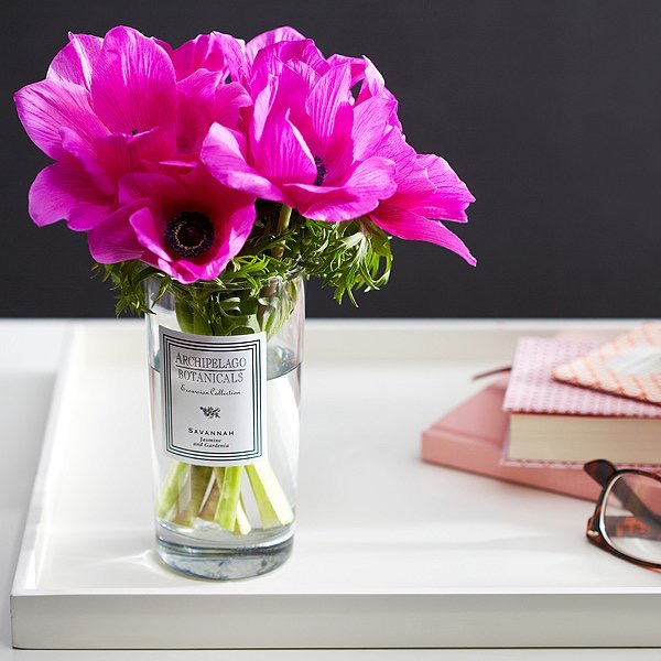
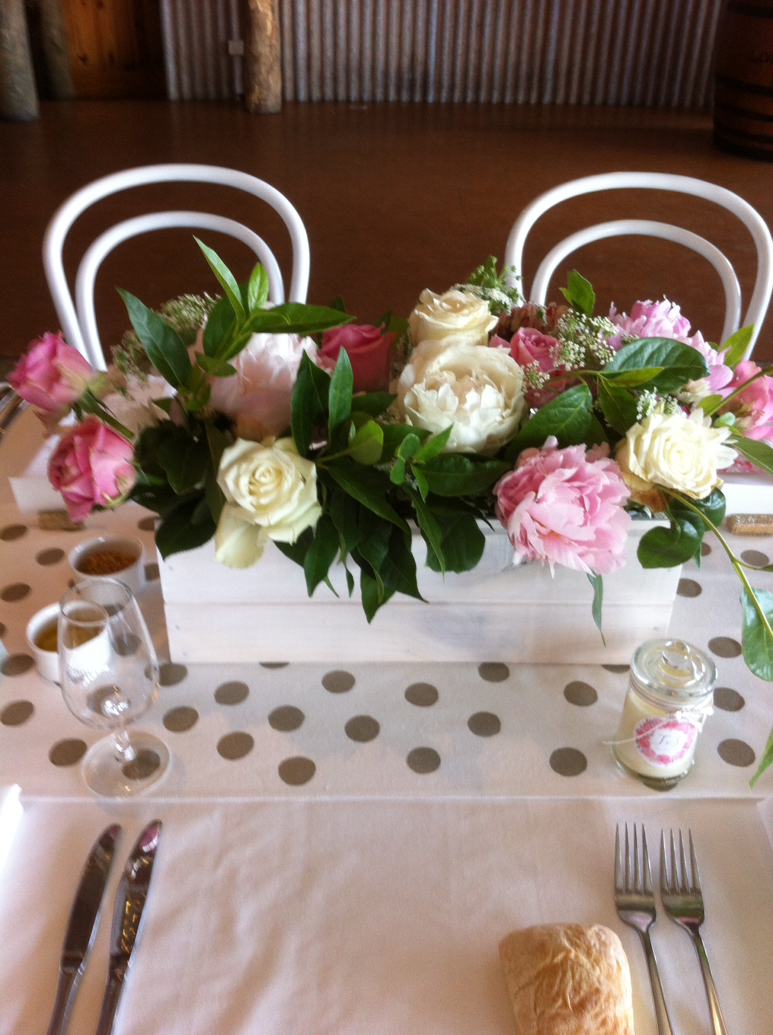
And never underestimate the pink potential as the go-to accent…
But the ultimate in all pinkesque…the seal of a Barbie Pink Pout ![]() …
…
 Till next time.
Tipsy Pipsy xo