

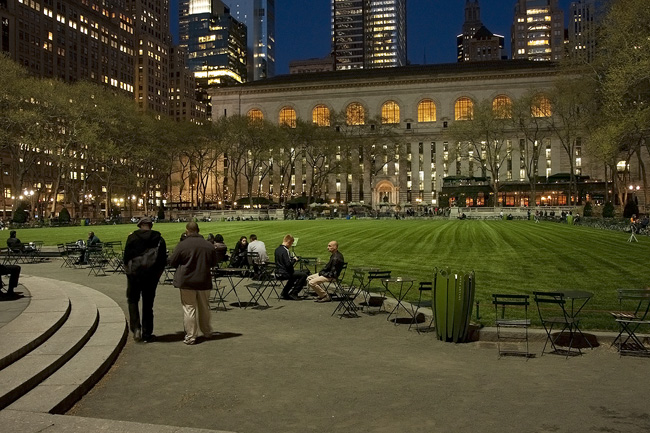
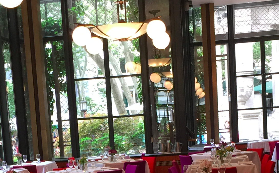
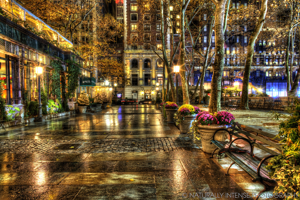
One of my favourite restaurants in New York City would have to be Bryant Park Grill and whilst everytime I have eaten there, I have enjoyed the food, for me, it is totally about the decor. Oh, and maybe cos its set on the park….looks over a fabulous Holiday European Village and ice skating rink each winter…And probably as it sits in the shadow of the New York Public Libray…Mmm…yes, most probably all of that ![]()
With the fabulous pink and purple combination, it reminds of sunset over the Sedona mountains (and they would be in Arizona ![]() ) My friend, JG, has a home there (actually, TCM actress, Jane Russell’s desert retreat) and a few years back I was lucky enough to go visit. The living room in her house has the most wonderful floor to ceiling portrait windows that look directly up to the rocky landscape and one is treated with the pleasure of watching the show of colours with the light changes throughout the day. The spectacular final curtain call being when the display cues to the night. If you have ever made the trip to Ayers Rock, you will get how transfixing the show can be.
) My friend, JG, has a home there (actually, TCM actress, Jane Russell’s desert retreat) and a few years back I was lucky enough to go visit. The living room in her house has the most wonderful floor to ceiling portrait windows that look directly up to the rocky landscape and one is treated with the pleasure of watching the show of colours with the light changes throughout the day. The spectacular final curtain call being when the display cues to the night. If you have ever made the trip to Ayers Rock, you will get how transfixing the show can be.
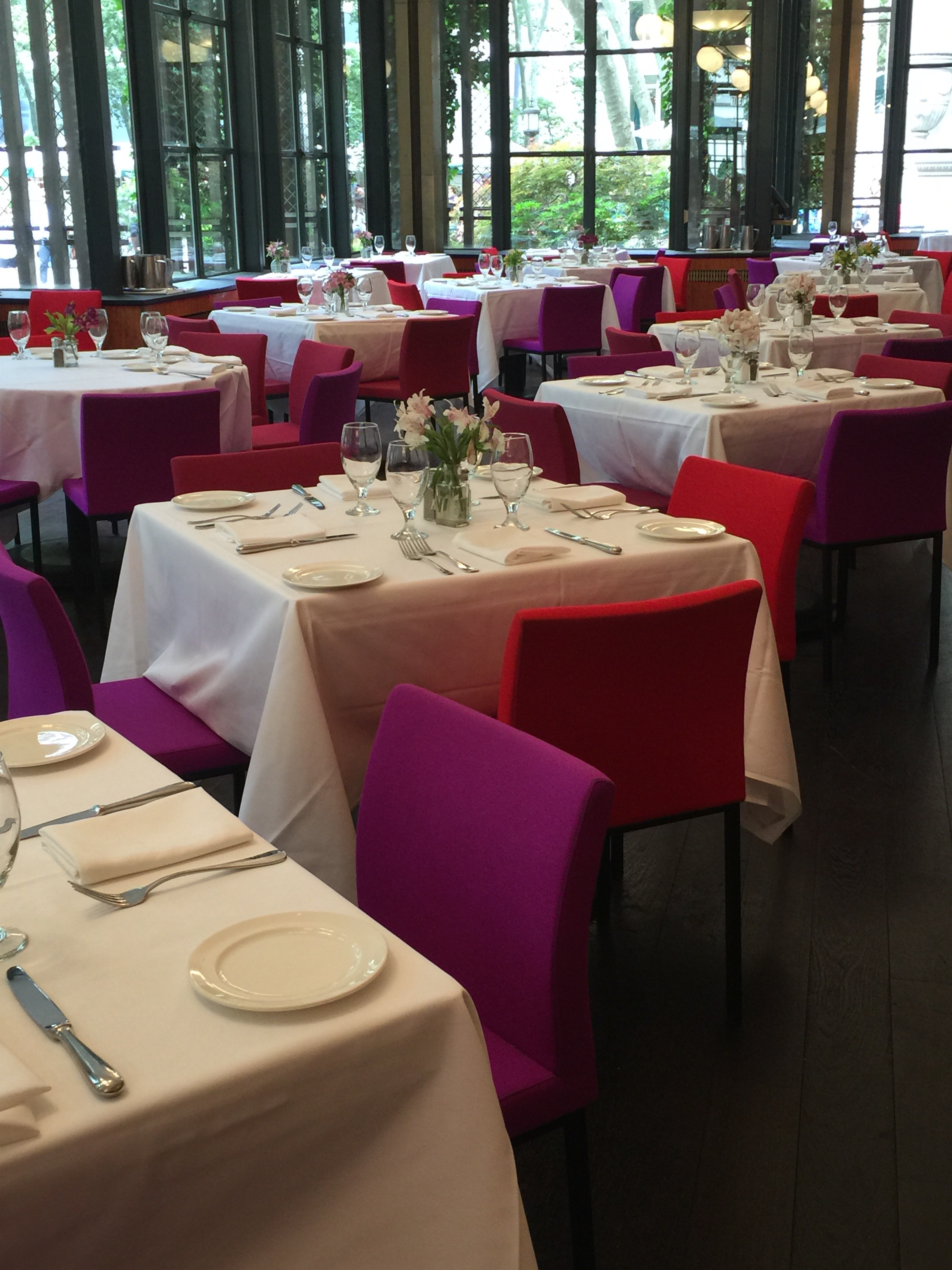
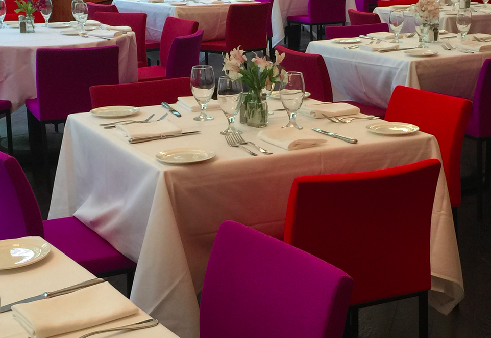
Anyhoo…bringing it back to the city…the burst of hot pink and vibrant purple is a unexpected colour combination and creates a cheery yet sophisticated contemporary vibe. For a long time, interior decorators steered away from these hues, fearing they were too feminine or young, but with the re-introduction of retro decor and fashion, the rule is now the brighter the better (if, of course, that is the way one is going with their designs. The other very popular trend is still all natural elements and wood however that seems to be slowing losing some of its momentum according to the featured homes in glossy design magazines. Not out by any means, but a little lack lustre-ish)
Tinerate, Bryant Park Grill restaurant has successfully captured the design essence of the moment: both of them! Cleverly combining the pop of colour of this instant with the interior decorator’s favourite natural browns and, Ta Daa…Hullo statement piece ![]()
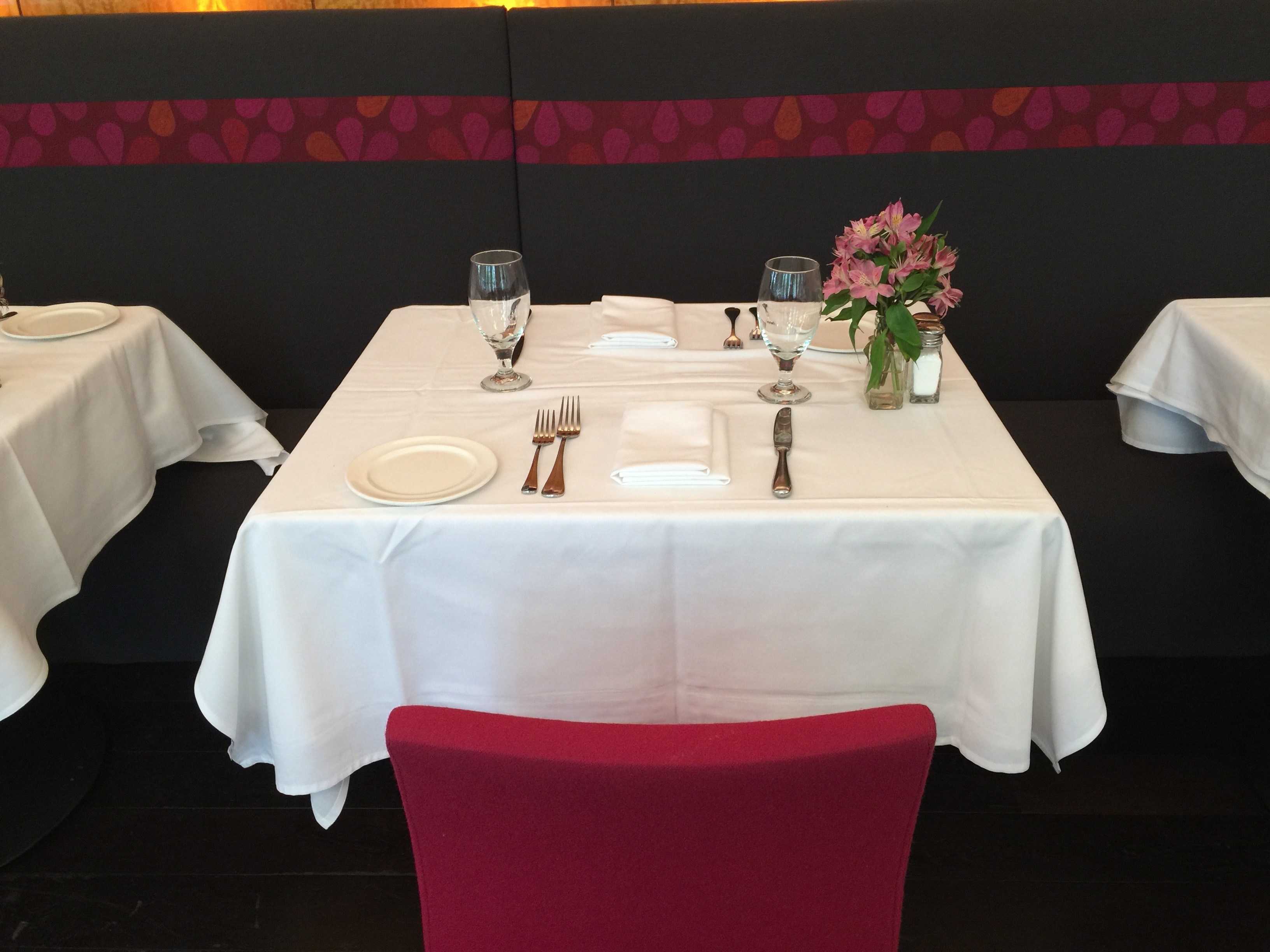
I have always thought that brown and pink is a colour combination that stands out from the crowd and demands attention. It works anywhere, on anyone and usually for anything…it just needs to be accessorised correctly.
Keeping it all light is the pink strip along the back of this chocolate brown row bench which supplies the lift that the look needs (undoubtedly, way too heavy – and dreary – without it) …
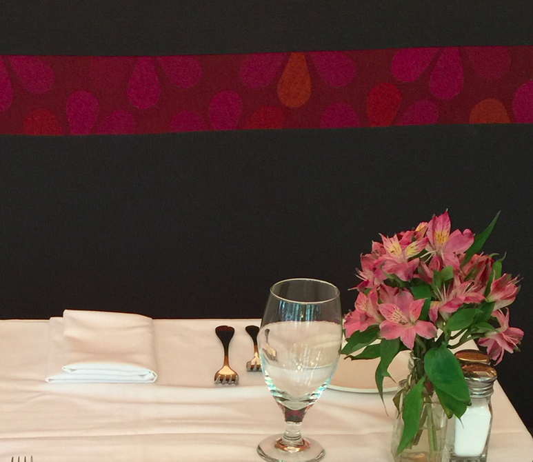
and it all comes together with picture-perfection by the enhancing crisp linen tablecloths and huge windows overlooking the green of the park…
Really is a treat isn’t it. So what shall I put you down for? Brunch, lunch, dinner or maybe afternoon tea???
Till next time.
Tipsy Pipsy xo